New colours, new pictures
By the time chemistry had caught up with painting, the palette was already centuries old. Lead white, bone black, ochres, vermilion, madder — these were the materials of Renaissance workshops and they were still the materials of the late eighteenth-century studio. Then, within roughly fifty years, three families of synthetic pigment arrived and changed what was optically possible on a canvas.
Lead chromate — chrome yellow — was isolated and characterised in the first decade of the nineteenth century. Cadmium yellow followed in the 1840s, once the metal itself had been identified and its sulphide compound proved stable enough to grind and sell. Cobalt blue had been prepared as a ceramic glaze much earlier, but the pure pigment suitable for oil painting reached suppliers in commercial quantities around 1807. Each of these arrived not from an artist's experiment but from industrial chemistry: the colour trade and the dye industry were doing the research, and painters were the downstream beneficiaries.
The consequences were immediate and specific. Chrome yellow offered an intensity that gamboge and the older lead-tin yellows could not match, and it was cheap. Cadmium yellow ran from pale lemon to deep orange-gold depending on how the preparation was made (and, later, on the addition of selenide for the deeper orange and red shades), giving painters a graduated family of warm hues from a single chemical series. Cobalt blue was optically cleaner than smalt, more stable than Prussian blue in admixture with lead white, and it dried at a useful rate in oil — a practical matter that the earlier blues had made difficult.

Taken together, these three additions reshaped what painters could reach for when mixing. A high-key yellow against a high-key blue was now achievable with pigments that held their positions rather than degrading toward mud. When colour theory arrived in the studio — Chevreul's work on simultaneous contrast circulating among painters after mid-century — the theoretical demand for sharp complementary relationships had practical pigments to meet it. The argument between yellow and violet, between orange and blue, that organises so much Impressionist and Post-Impressionist surface was not purely a matter of seeing differently: it was also a matter of having the materials.
What the chemistry actually permitted
Understanding why these colours mattered means understanding what the old palette lacked. The yellows available before chrome were either fugitive (gamboge faded badly in light) or narrow in range (yellow ochre is warm but dull). Lead white could lighten, but it also cooled and deadened. Chrome yellow was aggressive, opaque, and available in quantity. It pushed the tonal key of a painting upward in a way that forced everything else to compete.
Cadmium was more expensive and slower to become universal, but by the 1880s it was appearing in studio stock lists. Its greater lightfastness over chrome — chrome yellow notoriously darkens and greens with age under certain conditions, because lead chromate can shift toward lead sulphate — made it the preferred warm yellow for painters who were alert to longevity. The discolouration visible in some pictures from the period is partly a story of unequal chemistry: canvases painted with chrome have shifted; those painted with cadmium largely have not.
Cobalt blue's arrival mattered in a different register. It is a cooler, slightly greyer blue than ultramarine, and its behaviour in thin paint is distinctive — semi-transparent, it reads differently in glaze than in body. Painters who used it alongside the newly affordable synthetic ultramarine (which became commercially viable after 1828, following the competition to replicate lapis lazuli chemically) had two blues of markedly different character and could set them against each other within a single work.
Chronology
- c. 1807cobalt blue available as a stable pigment for oil painting
- c. 1809–1820schrome yellow enters commercial distribution
- 1828synthetic ultramarine produced commercially, following prize competition
- 1840s onwardcadmium yellow reaches artists' suppliers
What the chemistry permitted, then, was not just brighter pictures. It was a wider separation between the poles of the palette — a greater distance between warm and cool, saturated and desaturated, that made structural relationships based on colour opposition easier to sustain at scale. The pictures that followed were reading these new distances, not inventing them from imagination alone. The palette had become an argument before the brush touched the canvas.
Chrome yellow offered an intensity that gamboge and the older lead-tin yellows could not match, and it was cheap.

Raking light does the reading for you — the cracks follow the weave of the support and the drying of the layers above it.
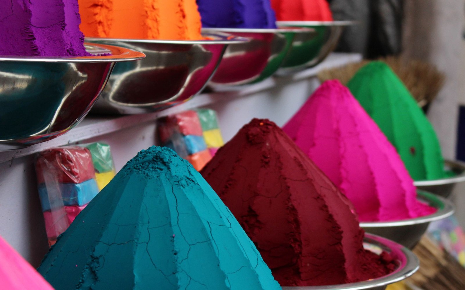
Photo: Satyam Sanghal / Pexels
A note on instability
- Chrome yellow (lead chromate)
- prone to darkening or greening over time; some nineteenth-century works have visibly shifted
- Cadmium yellow (cadmium sulphide/selenide)
- generally more lightfast; has remained stable in most surviving works
- Cobalt blue
- stable; dries usefully in oil; behaviour in thin paint differs from ultramarine
Where the sources disagree, this entry sets the disagreement out rather than resolving it. Nothing here is ranked as greatest or most important; corrections are welcome and are logged at the foot of the entry they change.